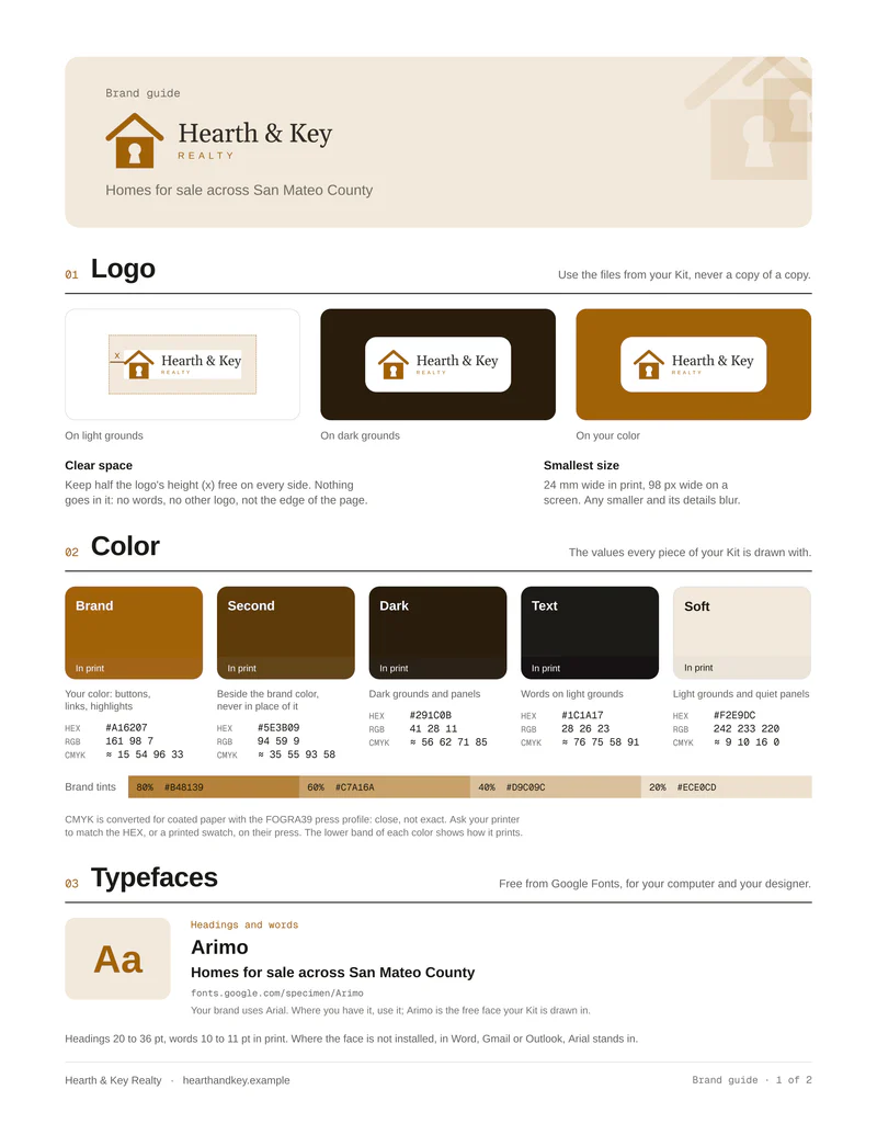
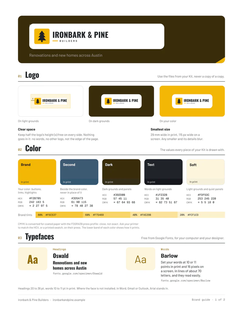
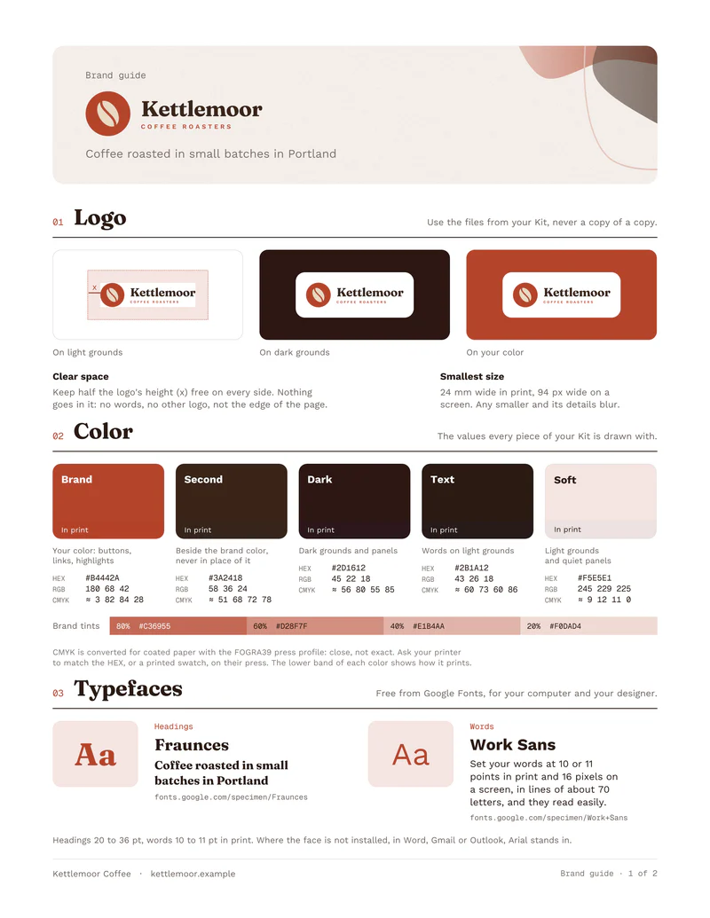
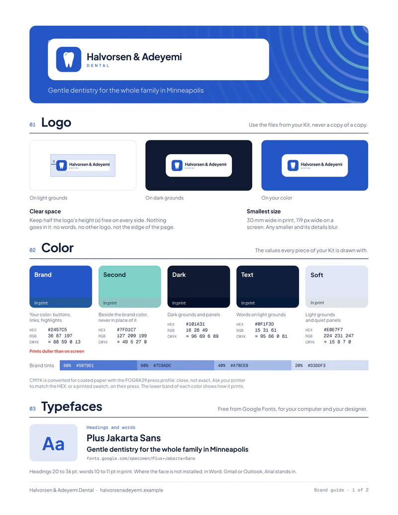
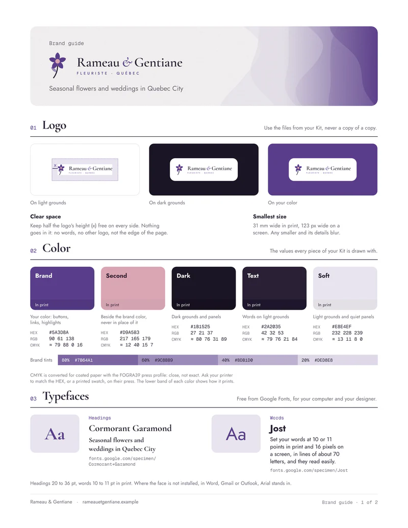
These are brand guidelines for 9 small businesses: one sheet each, printed on both sides. The front sets out the logo, the colors with their HEX, RGB and CMYK values, and the typefaces. The back shows what never to do with the logo, which colors read together, and the brand at work.
Every business here is made up. esigna’s Brand Kit drew each guide from its logo, colors and fonts, as it draws yours from your website. Click a page to read it full size.
A guide a printer, a designer or a new hire can use answers six questions. Every example on this page answers them in the same order, numbered as they are on the sheet.
On the front
01
Logo
The logo on white, on a dark ground and on the brand color, the space to keep clear around it, and the smallest size it stays sharp at in print and on screen.
02
Color
Each color’s job, from the brand color to the soft one behind panels, with HEX for the web, RGB for screens, CMYK for print, and lighter tints.
03
Typefaces
The face for headings and the one for words, the sizes to set them in, and the font Word, Gmail and Outlook show where yours isn’t installed.
On the back
04
Never do this
The logo stretched, turned, recolored, given a shadow, set where it fades and set on a busy picture, each one drawn from the real logo.
05
Colors that read
Every pair of colors you might set words in, with its contrast ratio and what it’s fit for, from any text to large headings only.
06
At work
The brand on its own pieces, drawn in one look: the business card, the letterhead, the covers and the posts.
9 examples
9 brand guidelines examples
Nine businesses in nine trades, each drawn in its own look. Under each guide are its colors and typefaces, the values a printer or a designer asks for first.
FrontBack
01Coffee roaster·Portland, Oregon
Kettlemoor Coffee
One warm terracotta and a dark taken from roasted coffee. Fraunces gives the headings their character, so the words can stay in plain Work Sans.
Cobalt carries the brand and mint stays decoration, since the guide marks mint on white as not for words. One typeface, Plus Jakarta Sans, sets both headings and text.
Forest green with a brass second, in the IBM Plex pair: the serif for headings, its sans for words. Words in brass don’t read on white, so brass is kept for rules and details.
Safety yellow suits signs and site boards, but on white it fails for words, and the guide says so. Yellow reads on the dark ground, and words on white go in charcoal.
A soft sage on a sand ground suits a studio, but sage on white is for large headings only. Body text goes in the deep green, and DM Serif Display takes the headings.
A brand guide is one piece of a brand kit. These three sample Kits show every piece drawn in one look, from the email signature and the business card to the letterhead and the covers. Open one to see all of it.
The rules: how the logo, colors and type are used, and what never to do. For a small business, one or two pages, like the guides on this page, which esigna calls a brand guide.
Brand kit
The files those rules make: the logo files, the business card, the letterhead, the social covers and the email signature, all drawn alike.Open a sample Kit
Brand book
A longer document that adds the story, the voice and the values to the rules. Large companies fill dozens of pages; most small businesses need the two pages above first.
Make your own
How to make brand guidelines for a small business
You need your logo, two or three colors and one or two typefaces. Then:
01
Find your best logo file
An SVG or the largest PNG you have, on a clear ground, with a version for dark grounds if your logo is dark.
02
Name your colors by their job
One brand color, at most one second, a dark for words and a soft color for panels. Write down each one’s HEX, RGB and CMYK.
03
Pick one or two typefaces
Free ones from Google Fonts, so your designer, your printer and your team can all install them.
04
Set the logo’s rules
The clear space around it, the smallest size it may print at, and the grounds it may sit on.
05
Check your colors for contrast
Test each pair you’d set words in against the WCAG ratios: 4.5:1 for text, 3:1 for large headings.
06
Show it at work
Put the rules on your card, your letterhead and your covers, then send one PDF to whoever makes something for you.
Or start from your website: the Brand Kit reads your logo, colors and fonts, and draws this guide with every other piece. Making a Kit is free, with no account; downloading the guide’s PDF and logo files needs the Brand Kit plan.
At least the logo and how to use it (on light and dark grounds, its clear space and its smallest size), the colors with HEX, RGB and CMYK values, and the typefaces. Good guidelines add what never to do with the logo, which color pairs are readable, and the brand on real pieces.
How long should brand guidelines be?
For a small business, one or two pages is enough, as long as they answer what a printer, a designer or a new hire asks first: the logo file, the exact colors and the fonts. Large companies write brand books of dozens of pages, mostly about voice and values.
What is the difference between brand guidelines and a brand kit?
Brand guidelines are the rules; a brand kit is the set of files made with them, such as the logo files, the business card, the letterhead and the social covers. esigna’s Brand Kit comes with a brand guide, so the rules and the pieces always match.
Why do brand guidelines give CMYK as well as HEX?
Screens show color as light, in RGB and HEX, but presses print with four inks, CMYK. The guides here convert each color through the FOGRA39 profile for coated paper, which is close but not exact, so they also tell the printer to match the HEX or a printed swatch.
Can I copy these brand guidelines examples?
Use them to see what a guide covers and how it’s laid out. The businesses are made up, so their logos and colors won’t fit yours. To get a guide with your own, make a Brand Kit from your website.
Can I make brand guidelines for free?
You can see yours free: the Brand Kit reads your website and draws your brand guide with no account and nothing to pay. Downloading the guide’s PDF and the logo files needs the Brand Kit plan, which you pay for once.
What file format should brand guidelines be?
A PDF, so it opens the same everywhere and prints at its true size, sent with the logo files. esigna’s brand guide downloads as a two page PDF on A4 or US Letter, with a ZIP of the logo, its versions for light and dark grounds where it needs them, the icon and the colors as text.
Brand Kit
Your brand guide, drawn from your website
Type your website’s address. The Brand Kit reads your logo, colors and fonts, then draws your brand guide, business card, letterhead and covers in one look. It’s free to make; downloading your brand guide needs the Brand Kit plan, paid once.